K&L Gates Brand
When Kirkpatrick & Lockhart LLP merged with Preston Gates Ellis LLP, they combined forces to create an international law firm with nearly 2,000 lawyers covering 9 legal practices, making it one of the largest law firms. This merger marked the beginning of 2007 with a young brand characterized by a logo, font, and colors.
To distinguish themselves in the competitive legal market and attract new clients, it was crucial for their brand to stand out and avoid the clichéd materials often associated with traditional law firms, saturated in hunter green and chunky serif fonts.
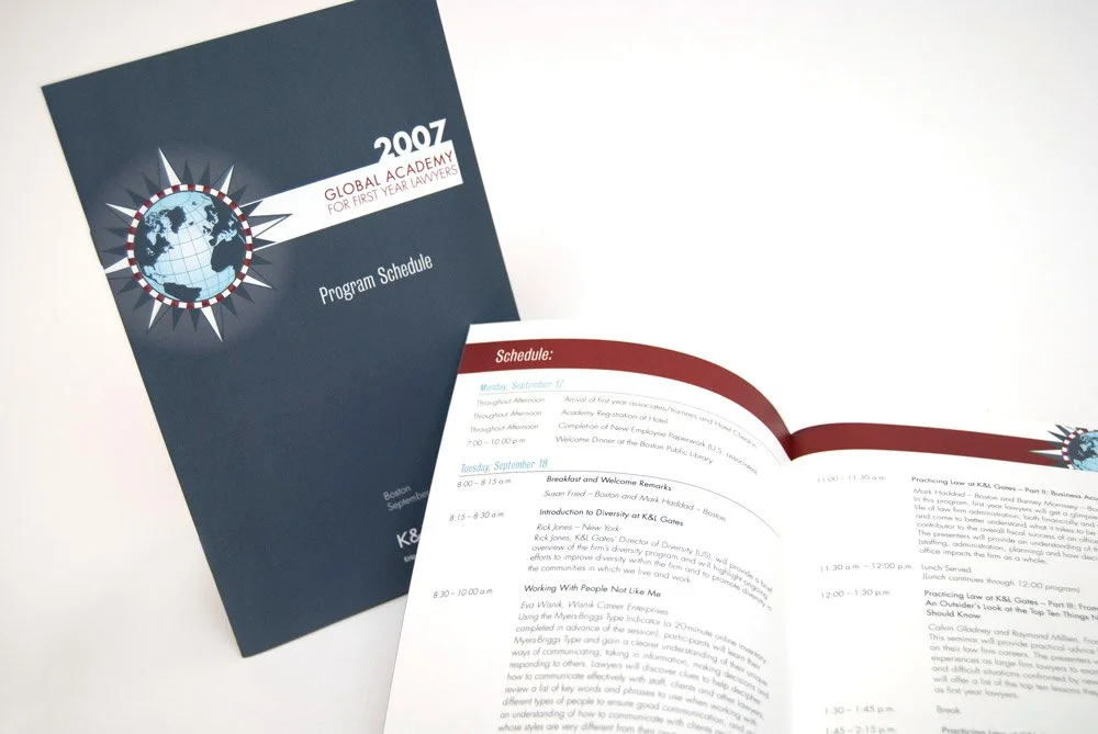
The brand transformation involved establishing a distinctive photography style featuring motion and shallow depths of fields. Additionally, defining grid layouts and utilizing banners of color helped create cohesive elements across various marketing collateral, event materials, the website, and advertising.


